Closing the Digital Divide in Education
Elsie Lee-RobbinsAmerican Institutes for Research
2021
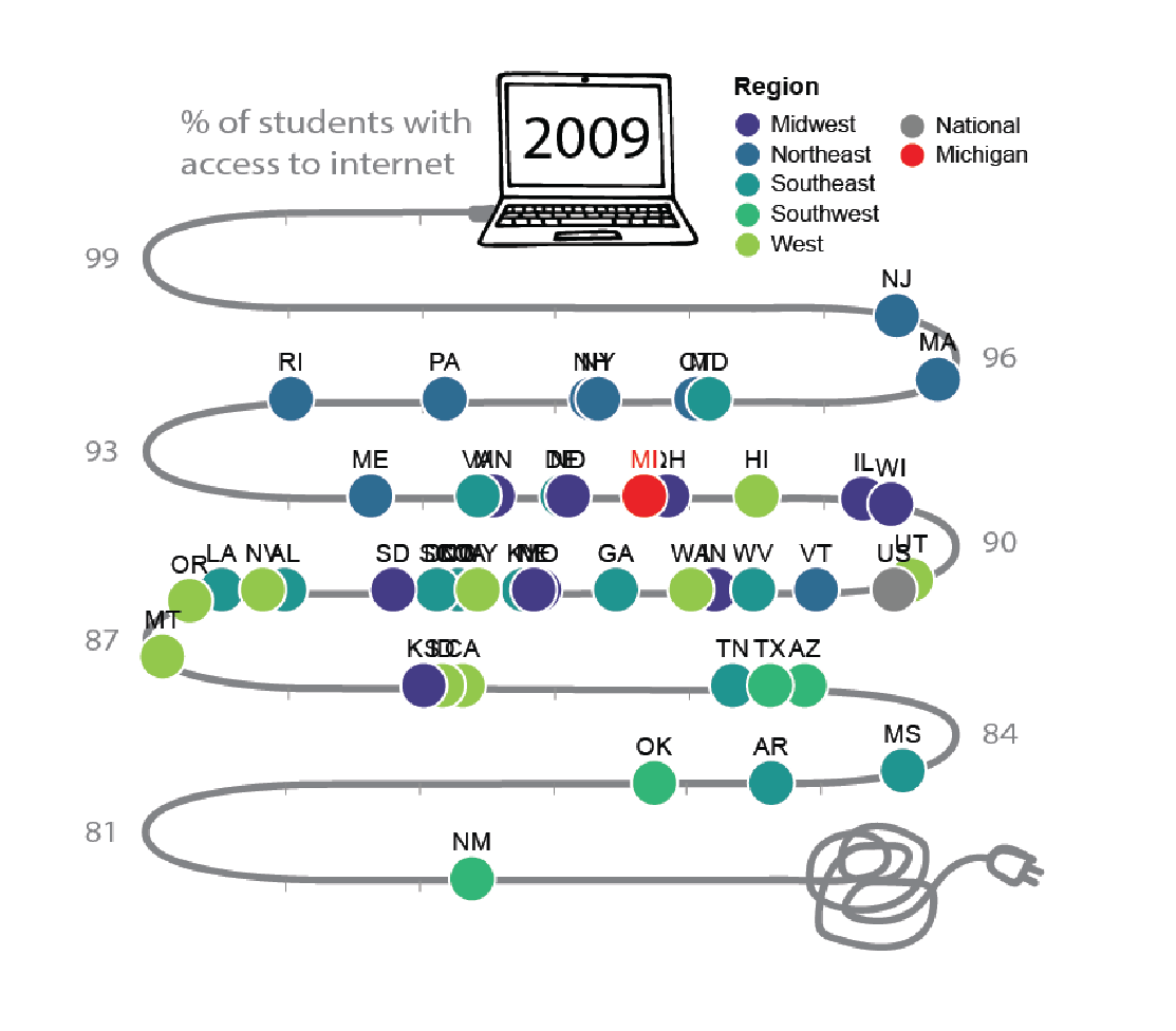
I visualized the National Assessment of Educational Progress (NAEP) data with two complementary reports. The first report, for parents and teachers, featured an animated, engaging ‘racing internet cable’ chart, to show how access to the internet increases over time. The second report, for researchers and policy makers, featured a bubble plot that showed the same data, but highlighted the difference from pre-pandemic initiatives to increased funding during the pandemic. I used Altair, Streamlit, Adobe Illustrator, and Adobe After Effects to design and create a high-fidelity mock up of these visualization reports.
See the full streamlit app here.